After his very informative talk, I asked him about a question that has been vexing me for some time: How to untangle visits to Plone.org throughout the day when we have a world-wide community of users? I had thought that perhaps there was a local time dimension hidden somewhere.
Turns out that the solution is different than I'd thought but elegant. The trick is to use geographical areas instead of timezones.
Here's the result. Asia-Oceania is orange, the Americas are green, and Europe-Africa is Yellow. This gives us a very rough cut at timezones.
 If we'd wanted finer resolution, we'd have used narrower bands of countries, but for this example plus-0r-minus 5 hours or so works well without a lot of effort.
Here's the how-to.
First, create advanced segments that match timezones.
- This is done under Settings | Advanced Segments (beta).
- Click on "Create new custom segment."
- At this point click on "Visitors" to expand the dimension list.
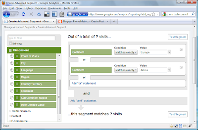
- Scroll down to the dimension of interest, in my case "Continent."
- Drag "Continent" onto the dotted box labeled "Dimension or Metric." Use regions or countries for higher resolution.
- Leave the condition as "Matches exactly."
- From the Value pull-down select, for example, "Europe." (True, this includes data from extreme eastern Russia, but we're keeping this simple.)
- Click on "Add 'or' statement."
- Repeat for a Value of "Africa" to include everyone in approximately UTC 0 to 4. Your segment should look something like the figure below.
- Save the segment under a meaningful name.
- Repeat for other geographical bands that represent the time slices you are interested in.
 Now we can view our data.
 - Back at the dashboard, select Visitors | Pageviews (or whatever y-axis value you like).
- Select the "Hour" icon.
- Set your date range.
- Using the (Beta) Advanced Segments pull-down in the upper right, check the boxes for your custom segments.
- Click "Apply" and, voila! you have our graph above. Remember that the hourly times given are Google Standard Time, aka San Francisco or UTC -8.
In Europe and Africa, interestingly, we see dual peaks at 10:00 and at 13:00-15:00.
In North America, there's only a single peak around 11:00. Perhaps if I graph North American usage by states, I'll see a lunchtime dip, but our fastfood lunch hours may be showing up.
In Asia and Oceania I may have lumped things together too coarsely. Here there's a broad maximum from about 18:00 until 2:00 in the morning, which corresponds very roughly to mid-day when adjusted for UTC offset. I should go back and create two or three more segments. One would be an east Asia segment for Japan, Korea, China, Australia, and New Zealand. A second would be Indian, Pakistan, and other central Asian countries. A third might be southeast Asia.
So there you have it, hourly data from Analytics for a world-wide audiance. Enjoy!


No comments:
Post a Comment